How to create a pivot table in Google Sheets
Learn how to create a pivot table in Google Sheets to summarize, filter, and analyze large data sets quickly, without any formulas.

Quick answer
Select your data range with headers, then click Insert followed by Pivot table. Choose whether to place it on a new sheet or existing one, then click Create. In the side panel, add fields to Rows, Columns, and Values sections to build your summary instantly.
Steps at a glance
- Select the data range, including header row
- Click Insert, then choose Pivot table
- Pick a new sheet or existing sheet for output
- Click Create to open the pivot table editor
- Add fields to Rows and Columns in the side panel
- Add a field to Values to summarize your numbers
- Adjust summarize by, sort order, or filters as needed
Summary
A pivot table lets you reorganize and summarize spreadsheet data without writing formulas, turning rows of raw entries into grouped totals, averages, or counts. It's especially useful when you have hundreds or thousands of rows and need quick answers about trends or top performers.
Step-by-step guide
Step 1
Select your source data
Open your spreadsheet and highlight the range of cells you want to analyze, including the header row at the top. Every column in your selection needs a clear header, since Google Sheets uses these labels to populate the field lists later. If your data is already organized as a clean table, consider reviewing how to sort a table first so related entries are grouped logically.
Step 2
Insert the pivot table
Click Insert in the top menu, then select Pivot table from the dropdown. A dialog box appears asking where to place the output.
Step 3
Choose where the pivot table lives
Select New sheet to build the pivot table on a fresh tab, or Existing sheet to place it at a specific cell location. New sheet is usually the safer choice since it keeps your source data untouched. Click Create to confirm, and Google Sheets will open the pivot table editor with an empty grid on the left and a field panel on the right.
Step 4
Add rows and columns
In the side panel, click Add next to Rows and choose the field you want to group by, such as salesperson or region. Repeat this under Columns if you want a second dimension for comparison, like month or category. Google often shows suggested configurations under a Suggested section based on your data — you can click one of these to build the layout automatically.
Step 5
Add values to summarize
Click Add next to Values and select the numeric field you want to total, such as revenue or units sold. By default, Sheets sums the values, but you can click the dropdown next to the field and change Summarize by to Average, Count, Max, Min, or other calculations. This is where the pivot table does the heavy lifting that would otherwise require a manual SUM formula for each group.
Step 6
Filter or refine the results
Click Add next to Filters to narrow the pivot table down to specific values, such as only one region or a date range. You can also click column headers within the pivot table itself to sort results ascending or descending. If you need more advanced filtering across your original data, review how to create a filter for additional control.
Step 7
Review and adjust as needed
Scroll through your pivot table to confirm the totals match what you expect, and remove or swap fields in the side panel if the grouping isn't quite right. You can rename the pivot sheet tab, add a new sheet for a second pivot view, or turn the results into a chart to visualize trends alongside the raw numbers.
Why this matters
You've got a spreadsheet with hundreds of sales, survey, or expense entries and need to spot patterns fast. A pivot table lets you group and total that data in seconds, so you can answer questions like which region or product performed best without building formulas manually.
Frequently asked questions
Do I need a paid Google account to use pivot tables?
No. Pivot tables are available to anyone with a free Google account using Google Sheets, whether through a personal Gmail login or a free Google Workspace trial.
Can I edit a pivot table after creating it?
Yes. Click anywhere inside the pivot table to reopen the side panel, where you can add, remove, or reorder fields in Rows, Columns, Values, and Filters at any time.
Can I turn a pivot table into a chart?
Yes. Select any cell in the pivot table, then use the steps to create a chart so your grouped totals display as a bar, column, or pie chart instead of a grid.
Why does my pivot table only show summarized numbers instead of every row?
That's the intended behavior. Pivot tables group and aggregate data rather than listing individual rows, which is what makes them useful for spotting totals and trends across large data sets.
Related guides
Continue with more step-by-step guides for getting work done.
 How to create a chart in Google SheetsLearn how to turn spreadsheet data into a chart in Google Sheets, plus how to pick chart types, edit styles, and fix common display issues.
- How to filter data in Google SheetsLearn how to filter data in Google Sheets using column filters, filter by condition, and filter by values on the free plan.
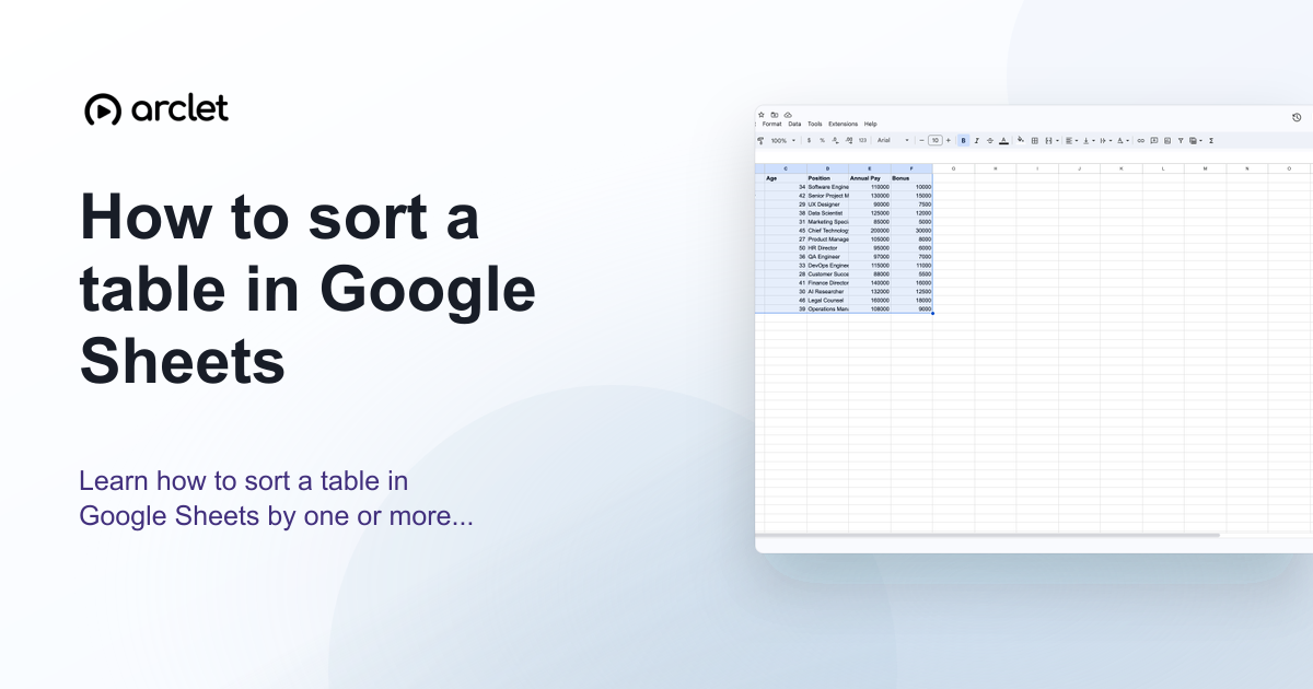 How to sort a table in Google SheetsLearn how to sort a table in Google Sheets by one or more columns, keep headers in place, and preserve row data correctly.
Create interactive demos like this one — free, no coding required.
Start for free →