The five parts
Before the parts, the shape. An interactive demo is not one artefact. It is a set of captured
screens with a separate instruction layer on top, a rule set describing what the viewer may click,
and a destination. Those layers are built at different times, by different people, and they go stale
at different rates. Treating them as one thing is why demo projects get estimated badly.
If you have not yet settled what counts as an interactive demo at all, the
category definition is the shorter read and comes first.
Captured states
A captured state is one frozen moment of the interface: the pixels, or the DOM, or both, exactly as
they appeared when someone recorded them.
What matters is that a state is a snapshot, not a live connection. Nothing in it is running. When
a viewer appears to type into a field, the demo is swapping one captured state for another that
already contains the typed text. This is why demos feel fast and why they cannot handle input the
recorder did not anticipate.
Two capture approaches are common. Image capture stores screenshots and is robust, small, and
completely rigid. DOM capture stores the page structure, so text can be edited afterwards and the
result stays sharp at any zoom, at the cost of breaking when the product's markup shifts underneath
it. Arclet's browser extension records real workflows today; DOM capture
and replay is currently behind a preview flag rather than generally available.
The practical consequence: your captured states are a photograph of one release. Every product
change that touches the recorded screens invalidates part of the demo. Nothing warns you.
Guidance
Guidance is the layer that tells the viewer where to look and why it matters. Tooltips, highlights,
a dimmed background around one control, a short line of copy.
The important property is that guidance is separate from the capture. You can rewrite every
tooltip without re-recording, and you can re-record without rewriting the tooltips, provided the
control did not move. Keeping the layers separate is what makes a demo maintainable, and collapsing
them, by burning captions into images, is a reliable way to make every future edit expensive.
Guidance also carries most of the demo's voice. The captures show what the product does. The
guidance is where you explain why anyone should care, and it is the part worth writing carefully.
Arclet analyzed 600 public interactive product demos and found guidance is close to standard: among
the 555 records whose player structure could be read, 457 carried explanatory copy on at least half
their screens and 294 carried it on every screen. The median guidance block ran 78 characters, a
sentence rather than a label. What the data cannot tell you is whether any given sentence explains why the
action mattered or merely narrates it, which is still a writing problem, not a tooling one.
Interaction
Interaction is the rule set: which regions of which state respond, and what happens when they are
clicked.
The design decision here is how much freedom to grant. A demo where exactly one hotspot is live on
each screen is easy to build, easy to keep correct, and feels like being led by the wrist. A demo
where several controls respond feels like software, and every additional live control is another
path you have to have captured.
This tradeoff is the substance of the format choice, which is covered in
types of interactive product demos.
Branching
Branching is what happens when the viewer does something you did not plan for.
There are three honest answers, and every demo picks one. Ignore the click, which is cheap and
slightly insulting. Nudge the viewer back to the intended control, which is the usual compromise.
Or genuinely follow them down a second path, which means capturing and maintaining that path too.
Real branching is where cost stops being linear. Two meaningful branch points can mean four end
states to record, review and keep current. This is the part of a demo that gets scoped as an
afternoon and turns into a fortnight. Branching demo paths are a direction we are working toward
rather than something Arclet ships today.
Branching is rarer in the wild than the feature lists suggest. Arclet's analysis of 600 public
interactive product demos found branch-capable structure in 100 of the 555 records whose player
structure could be read. Most published demos are linear. That count is also an upper bound:
the same control builds chapter and navigation menus, so the analysis could not tell how many of
those branches actually answered a different question versus existing because the player made
branching available. See
interactive product demo examples: what 600 public demos reveal
for the full breakdown.
The outcome
Every demo should be steering at one moment: the dashboard populated, the report shared, the alert
resolved. Something a viewer can recognise as the payoff.
A demo without a defined outcome does not fail loudly. It just wanders, adds screens over time
because each one seemed worth showing, and finishes somewhere ambiguous. Deciding the last frame
first is the cheapest editing discipline available, because it tells you which screens are not
earning their place.
Where the cost actually lands
Fifteen years of building software has made me suspicious of estimates that only count the first
version, and interactive demos are a good example of why.
Scroll to see every column.
Where the cost actually lands comparison
| Part |
Build cost |
What makes it go stale |
| Captured states |
Low, once the workflow is decided |
Any UI change to a recorded screen |
| Guidance |
Moderate; it is writing, not tooling |
Positioning changes, and shifts in what you want to emphasise |
| Interaction |
Low for one path, rising with each live control |
Controls moving, renaming, or being removed |
| Branching |
High, and it multiplies |
Every branch inherits every other part's staleness |
| Outcome |
Low |
Changes when the product's value proposition moves |
The pattern is that build cost concentrates in branching while staleness concentrates in capture.
A team that scopes only the build will underestimate the second year badly.
Whether that ongoing cost is worth carrying depends entirely on the workflow you picked, which is
the subject of benefits and limitations.
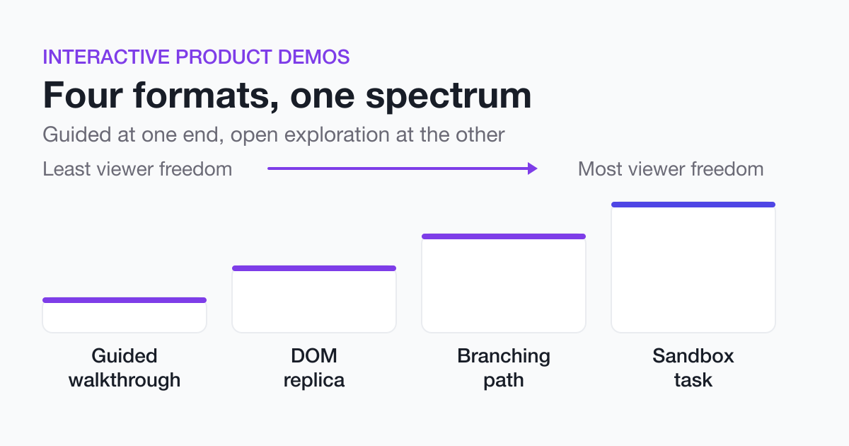 Types of Interactive Product DemosGuided walkthroughs, DOM replicas, branching paths, and sandbox tasks trade fidelity against effort against viewer freedom. Here is how to pick one.
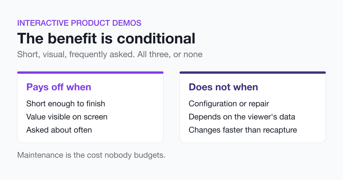 Interactive Product Demos: Benefits and LimitationsLearn when an interactive demo pays off: short, visual, frequently asked workflows. Plus the maintenance cost and the cases where you should not build one.
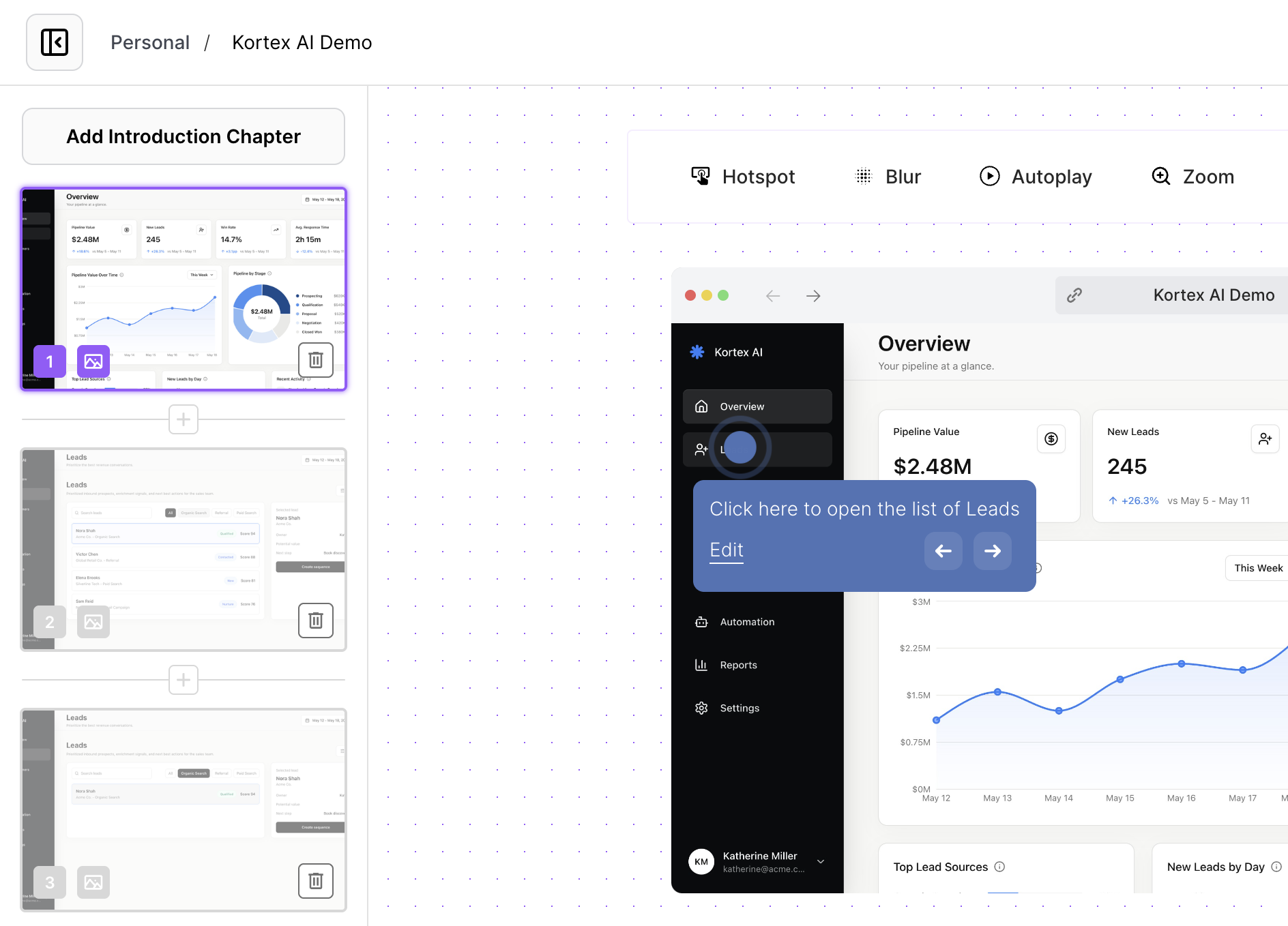 Interactive Product Workflow Demos for TeamsShare interactive product workflow demos for roadmap context, release handoffs, stakeholder reviews, and cross-functional launch work.